I have absolutely no recollection of first finding Alex Pardee’s work, to the point where it feels like I’ve always known about it, which is one of the reasons it’s so endearing to me.
It’s something that SHOULD jump out at you so much that you could never forget seeing it for the first time and yet, it’s ingrained so much into my brain that I don’t remember meeting this little creations.
His work is disgusting yet incredibly beautiful at the same time.
It’s gross and violent but the colours and textures are so endearing that it doesn’t seem that way.
The reason I think this works is his creatures are actually adorable in all the superficial ways, yet they’re gooey and have sharp teeth and are gross around that.
I would LOVE to see (or make) a film that uses this amazing juxtaposition.
I’ve said before in these blogs that the audiences of the world are becoming more open to strange and risky / risqué content and I think this would be a fun aesthetic to unleash on the world!
I’ve always been a big believer in USING ALL THE COLOURS. I don’t like when a colour palette is too muted (in post). If it is the production designer and cinematographer’s intention to light a scene dull-y, then so be it.
But even dark stories could use vibrant colours to their advantage.
This art definitely gives major Rick and Morty vibes. And that show is wildly successful. Mostly due to writing, but I think largely also due to its ‘trippy’ aesthetic.
This could equally be melting alien flesh, or ice cream. Who knows?
And lastly, one of my favourites. It’s just so intricate yet random. I really respect that in art. When an artist trusts the beauty of spontaneity but is also dedicated and careful.
Alex Pardee certainly is that, and I love his style.
As an aspiring director / production designer, I often find images that give little sparks of inspiration. Ones that make me think of stories or ‘wow, I’d love to set something here’.
I’ll post these types of images below
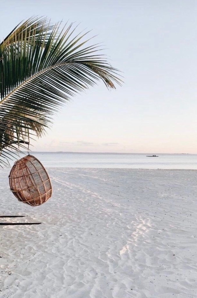
This is a ceiling, but if you imagine it as a wall it opens the door for so many new architectural ideas Greece was one of my favourite places I’ve ever been and it’s half due to streets like theseI can only think of what could go wrongThis is a chapel in ArkansasYes this is a real house in PolandA lighthouse after an ice stormThis looks like a futuristic rocket shipThis is a café. Honestly doesn’t feel comfortable, but as a production designer there are many different emotions we’d be trying to evoke and this certainly has a ‘feeling’ about itChristmas in the 60sNope, it’s not a whale’s tail. It’s a museumAn abandoned power plantA train station in StockholmAn Egyptian courthouse maintaining the classic Egyptian styleI think this is a mall but it feels like the inside of some kind of alien shipI can imagine an iconic scene taking place on this train with this view This is my secondary school. Shoutout to Meánscoil GharmanDoor to where? Such a simple building but it gives off so much of an energyI think if I could go into my brain and find a physical ‘happy place’ it would probably look something like this Floyd’s Pelican Bar in Jamaica is a floating hutInside Floyd’s Pelican Bar guests can bring a souvenir and carve their name into the floor and walls I don’t know what the function of these things are but they’re in JordanThey look like space coloniesA bit of an optical illusion, this is a tunnel leading to somewhere in Seoul, South Korea
For the second short film project of Year 2 Film Fiction, I was assigned as production designer for a film called ‘Unexpected Love’.
After much of the crew expressed concern with the un-attainable casting and production needs, the screenwriter began rewriting, which went on for an excruciatingly long period of uncertainty and waiting.
As the production designer, it was important that I had a screenplay so I was aware of what props needed to be attained and made, characters that needed to be clothed and sets that needed to be designed and built.
A final script was never turned in before the shoots were cancelled due to COVID-19, but I did go ahead and design graphics, choose costumes and attain some props.
This is a fake Galway city bus map I made – It wasn’t important to the story, it was merely set dressing for a bus stopIn one scene the main character is on his laptop. The script says that he is looking at a dating website as well as other tabs open. I knew I couldn’t use copyrighted websites so I created my own desktop; this was one of the logos featuredHere is the entire desktop I designed. The dating site tab was created completely from scratch by me, and even features me as a kind young lady, named Bethany. If you look very closely, you’ll see I didn’t use any Microsoft or Google logos. All were changed to something of my own design. I knew these would never be visible but attention to detail is very important for this role. I rebranded Microsoft as MacroSolid (genius, I know), and Google as Oogle. The main character also has a seething hatred for Shawn Mendes, so I hid a tab of him to reveal some about the character, lol.Script breakdown I did for the original draft. Much of the sets and characters changed throughout the rewrites.This was a straightforward mood board and colour-palette I put together for scene 1 and the main character
I looked into people who cope with depression and learned that they often lack the motivation to clean their rooms and prefer to stay in the dark. I wanted to incorporate this to show what kind of person Cillian was and what his mental state was like. The script is all about how insecure Cillian is so I thought it was best to dress him in dark and non-flashy clothes, to show that he as a character would not like to stand out.
Colour palette and some inspo for Sarah
Sarah is supposed to be like a beam of light that arrives to rescue Cillian from his self-loathing ways (not exactly a healthy way to begin a love story, but hey I’m just the designer…)
I wanted her to be the only character / place in the film that contained vibrant colours. I was between 2 aesthetics that would have been debated. 1 was the more 80s / retro style, indicating that she’s comfortable dressing in styles that aren’t necessarily ‘in’. And 2 would be a more modern approach of a woman who just seems very confident and comfortable in her own skin and on her own.
Very straightforward designs for the doctor and Dad. I noted ‘not yellow’ as I didn’t want anyone to wear colours outside of the white-grey-black spectrum besides Sarah
The production was canned before filming could begin thanks to Covid-19, but it was certainly an interesting experience.
As this is my personal blog, I won’t be too shy talking about my time with this project. This was a very interesting experience for me because I hadn’t worked on a script that I didn’t particularly like before. I was also working with a difficult writer-director. I had a lot of issues with the story and messages it was sending, but I had to force myself to stay in my lane as production designer and just get the work done. However, the writer wasn’t taking into account that this was a budget-less endeavour and was including far too many sets for no reason. It was also very frustrating trying to get things removed / merged / changed to aid the crew and everyone involved. The writer took the script to begin reworking it and left the crew with no updated script for a month until we were 2 weeks out from our shoot date. It was painful but sure look…
It was an experience that forced me to try and be as professional as possible and one that MAY reflect working environments I might find myself in in the future.
Here I’ll post some artworks that have some relation to production design / aesthetics. Not exactly Mona Lisa type artwork but the kind of art that might be made by an art department to inspire their crew / generate ideas for a film.
‘School of Athens’ by Raphael is one of my all time favourite artworks. There’s something so dynamic about it that makes me want to be there in the building. All the characters have so much personality and it feels like an amazing place to be – even if it never existed. Which is one of the endearing things about film – we wish we could enter them and be part of that world for a whileThis image inspires lots of ideas for meI think the world is ready to start seeing stranger things in their media again. The more open-minded and experimental we get as creators the better, in my opinionVisualising what a character is feeling opens the door for filmmakers to do things that haven’t been done beforeWhy not have a character go into their mind in a trippy way while they go on a spiritual journey / go thru their character arc
I have always loved Tony Stark’s house from 2008’s ‘Iron Man’. I’m not generally a huge fan of super-modern homes, but this is an exception where I’d actually like to live.
The way the house sits on the edge of a cliff is not entirely unique, but I don’t think I’ve ever seen one as cool. The pillars that support the main saucer of the house have a garage built into them. Wicked.The aerial view here shows a helipad and the way the layers of the house all integrate to form one structure.
Normally when I see these kinds of buildings I think they look too much like airports and not enough like a home (see Justin Bieber’s house), but I don’t really feel that here.
The exterior is obviously something to behold…
… but the interior is just as cool in my opinion.
Live-action still of the living room from the movieConcept art of the living roomI love how outdoorsy it feels. It feels like a beach in and of itself. The way the sky and actual ocean come into a Sandy-coloured / rocky room with plants towards the back. I’d love to live hereSimilar to the Kendrick Bangs Kellogg house, this place looks like it comes from nature. Not just the rock and plant elements, the shape of the balcony and all the rounded shapes make it seem ‘organic’.
I love the colours of the house. The fact that it’s bright and airy and has earthy-colours makes it so much more liveable in my opinion, instead of jus looking like a lab, as many modern houses do.
Stark’s bedroom is so minimalist yet looks comfortable. It makes you think he spends very little time in here, and is usually in his garage working away on an invention. Great characterisation.Alternate angle. Not sure if I like the yellow-green colour here. It doesn’t really fit with the rest IMO.The bathroom is also pretty cool. Feels very sanitised and airy yet not quite corporate. These steps are pretty interesting. Definitely not a family house tho… I hope these giant windows are one-way. I’d probably get stage-fright with how open this is, lol. This gives a clearer sense of the shapeIt’s not as charming in black and white. There’s clearly much less focus on the estate itself and all energy seems to go into the house
P.S – Almost all of these blogs were created early and were routinely updated but not published until recently (May 2021), so the upload date will state when the blog was first created, even tho it was a work in progress throughout the semester
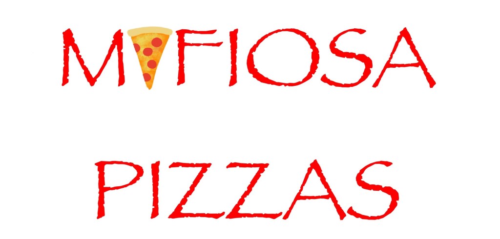
This year I got to work as director and assistant production designer to Ger Kelly, of a short film called ‘Bad Deal’, written by Conor O’Meara.
Although I eventually was promoted to director of the film, and my work as assistant production designer was passed onto our main production designer; I had fun coming up with graphics and designing logos.
We couldn’t use the GMIT logo in the film, and so I went about designing a logo for a fake university. Straightforward logo with a pizza for the ‘A’Here’s a faux-poster that would be on the wall. I deliberately put 2008 to indicate that this was a careless school, and that a single poster managed to remain up for almost 13 years
This was dated with water, spatters of juice from fruit, crinkled, and torn.
Simple poster to indicate what room we were in, a direct copy of the one in GMIT, but with the logo replacedTo reflect the delinquents that populated the college, I graffitied up the poster. I had to do a lot of research to see what kinds of things immature students would draw….. right…
Shorty after finishing these few graphics, I took over as director. But I was grateful for my stint as assistant production designer, because it gave me an idea of the attention to detail we put into these films. It was also a lot of fun to make things that had hints about the characters and story, even tho they wouldn’t be visible on-screen.
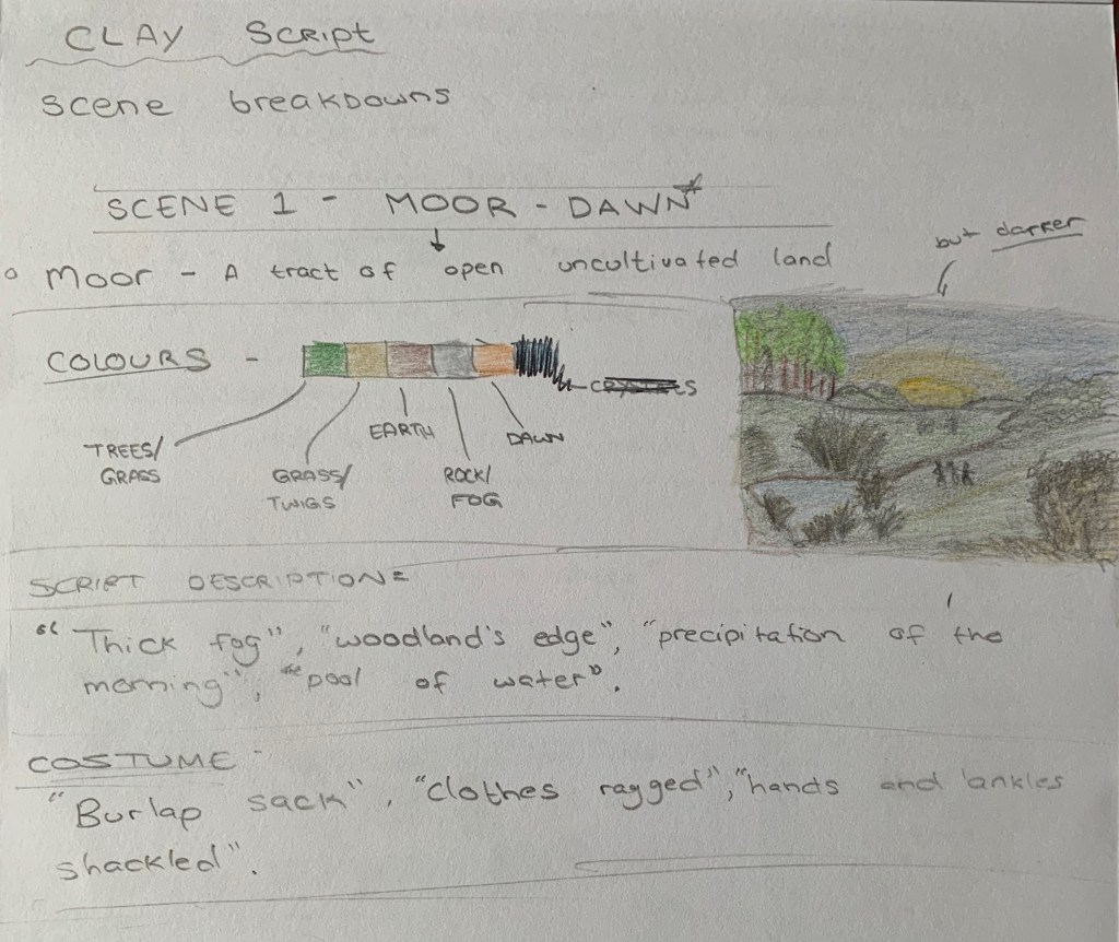
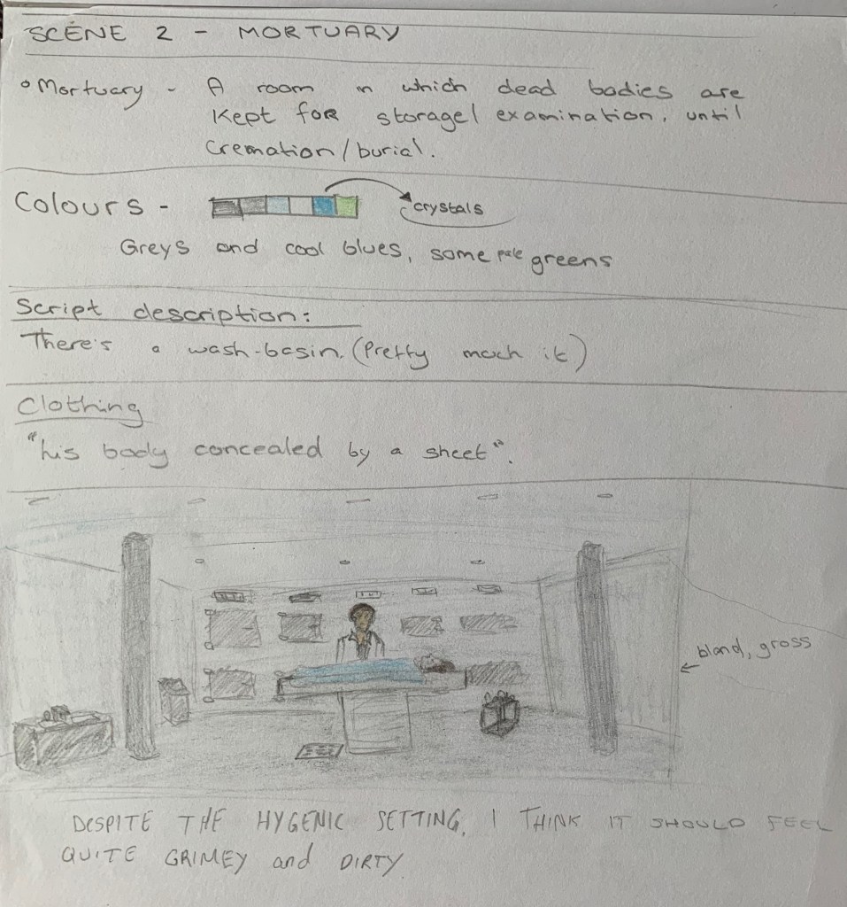
For Production Design in Year 1, our only major tasks were to break down a short script and design one of the sets. We also had to build a model of said set.
I began by doing a brief design of the first 2 locations / sets.
Scene 1 was set on a moor
I started by defining what a moor was.
Then deciding on the colours / aesthetic. I did this by reading the mood and situation. It was dirty, scary and mysterious. I went with muddy, uncomfortable colours.
Then I took excerpts from the script that described the location. I also included descriptions of costume.
And finally I did a sketch of the scene.
Scene 2 was set in a mortuary
Exact same process again.
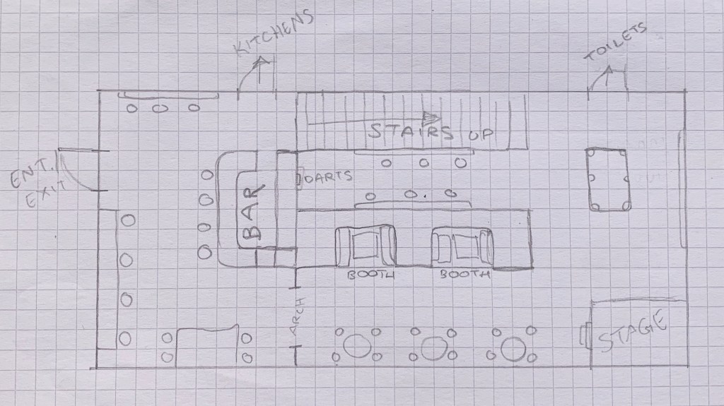
Scene 3 was set in a bar
I put a LOT more detail into this sketch as it was the location I was most interested in designing in depth for my model. You can see below the sketch the plans for the model.
The High Desert House – Joshua Tree, California – Designed by Kendrick Bangs Kellogg
Yes, this is real. I don’t remember where I came across it, but it has stuck with me for a long time. It doesn’t even look real. It looks like a miniature or something made with a 3D modelling software. It instantly reminded me of 2 things; A Bond villain’s lair, and Tony Stark’s house. Both of which I will be documenting as great feats of production design in film.
I have heard some people compare it to a pile of dishes in the sink, lol. I can see that, but the pure distinctiveness of it, and the technical skill put into it is really something to marvel at.
View looking down on the houseGates entering the ‘estate’. The desert plants really help push this other-worldly presence.Each angle looks like it has a completely different design while remaining consistent with the house overallThis angle is so odd that I’m not even sure what I’m looking at. But I love the little moat that surrounds the building hereThis really calls to mind an alien palace overlooking a desert planet. Or a Bond villain watching an Aston Martin approach his lair Something about this image feels much more ‘homey’. Perhaps it’s the warm colours, or the way it reminds me of a Spanish cottage. I love the metal grates and the way it fits perfectly with the walls and the desert. It’s rough but still beautifulIt carries so much personality. And the personality says; ‘I’m important and powerful’The structure here seems random and insane, but still geometrically geniusYou can picture a boujee party taking place here below the beautiful night sky. The house has another personality under this lightIt goes from very grey and ‘blended’ with the desert, to a work of art in the rocksThe shape here is simply masterful. It’s a sculpture as much as a buildingIf the exterior was a little too rough for you, the interior should put you at ease. It has plants, glass, softer colours and leather furniture. Once again it calls to mind all-manner of things; the Flintstones, Tony Stark’s house etc. I adore the shape of this place. The fireplace is incredibly unique and the greenery makes it feel so comfortablePart of me can’t help but think this is how humans would have evolved to build homes if we didn’t go in a more efficient direction
I would honestly love to live in this home. It has such a positive atmosphere, despite being made from rock and steel. The interior design works wonders at turning this from a Bond villain’s lair to some sort of alternate-reality family home
The spiral shape here is mesmerising. I’m struggling to find words to describe this place. It’s like a distant-future Hobbit HoleThe furniture here reminds me of animal Hyde. As if cavemen were building modern architecture.Just marvel at thisThere’s something vehicular about this image. It’s like something from a yacht or a spaceship.
The atmosphere and the sheer inventiveness of this house never ceases to amaze me. It’s like nothing I’ve ever seen and yet it reminds me of so much. It’s very inspiring and makes my imagination run wild. Anything that does that for me holds a place in my heart (and mind!).
I went down a somewhat winding road to come across this production designer, as I often do, browsing the internet. An amazing building called ‘Desert House’ by Kendrick Bangs Kellogg made me think of all the awesome production design seen in the James Bond films. I went looking and found some really gorgeous sketches by the British-German production designer, Ken Adam. He has won 2 and been nominated for 3 oscars.
The Conference Room – Concept art by production designer Ken Adam for ‘Thunderball’ (1965)We can see here that Adam’s vision was brought to life, almost exactly how he drew it.
This room screams espionage to me. There’s something very Soviet Union-esque about it.
The Pyramid Conrol Room – Concept art by Ken Adam for ‘Moonraker’ (1979)The Pyramid Control Room – Brought to life
I have to say that I’m not really a fan of the Pyramid Control Room as it appears on-screen. In the concept art, it looked futuristic and modern with the typical glass and steel aesthetic. The abundance of screens makes it looks quite messy.
Also, the over-reflecting floor makes it difficult to feel the space and the layout, and simply reflects the already copious screens.
The Iconic War Room from ‘Dr. Strangelove’ (1964) – as drawn by Ken AdamOnce again, Adam’s vision is brought to life with incredible accuracyBlofeld’s Volcano Lair – ‘You Only Live Twice’ (1967)
Something different about this concept art is that 1) it’s in colour, and 2) it’s less like an engineer’s drawing as the other’s are, and has quite an odd quality to it – where the perspective is a little off. Notice the stairs leading up on the left side of the drawing.
Another interesting concept of Blofeld’s LairBlofeld’s Lair brought to life
Another incredible set brought from imagination to the page, and finally, to real life, by the magnificent Ken Adam.
The sheer scale of this set is really awesome. the stone detail merger with the smooth concrete and bits and pieces of metal fits the aesthetic of the ‘villain lair’ really well. It also adds to the hidden quality of the operation.
Bullion Store, Fort Knox – ‘Goldfinger’ (1964)
Fort Knox is of course a real place, but the public, and even US Presidents don’t know what it looks like on the inside. Ken Adam had the task of designing part of it himself.
The final product
Once again, Adam adapts his concept art almost exactly as it was drawn.
All of his drawings are very similar in style, yet the final sets all stand apart as their own unique works of art. I think that is a feat worth mentioning.